
In HOSA's poster, display and presentation events, the judge meets your artefact before they meet you. A board is scanned from three metres, then read from one, then interrogated at arm's length — and most student boards are designed for only the third distance. This is a zone-by-zone layout, a chart-choice map, and the four visual traps that make honest work look weak.
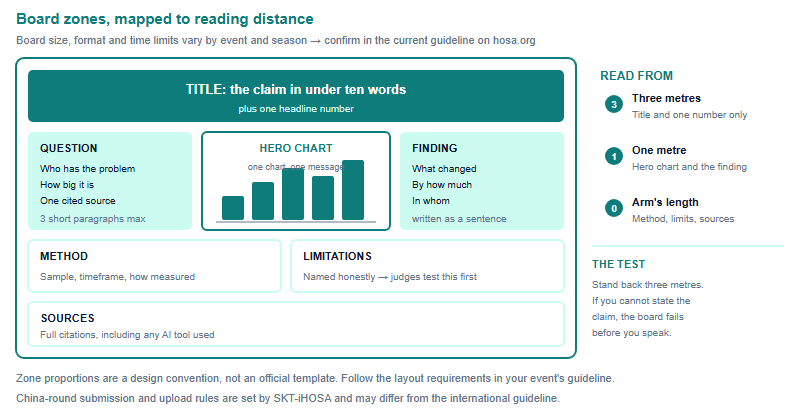
Judges read at three distances
HOSA runs several events where a visual artefact is the deliverable — Research Poster appears in the published guidelines index, Extemporaneous Health Poster appears in the guidelines index among the events unique to middle school members, and project and public-welfare work in the China round's BCE track is built around a delivered project rather than a test, and a board or a deck is a common way teams present it — confirm the judging format for your round with SKT-iHOSA. The exact size, format and time allowance differ by event and by season and are specified in that event's current guideline, so confirm those on hosa.org before you print anything. What is consistent is the viewing sequence.
At three metres a judge is deciding whether your board is worth approaching, and they can absorb perhaps six words and one shape. At one metre they are looking for your claim and your strongest piece of evidence. At arm's length they are checking method, limitations and sources — and that is where credibility is either confirmed or lost. Design each zone for the distance it will be read from, and the board does most of the explaining before you say anything.
One board, one claim
The single most common structural fault in student boards is that they present a topic rather than a claim. "Adolescent sleep" is a topic. "Boarding students in our year group lost an average of 52 minutes of sleep on nights before assessments" is a claim: it names a population, a measure and a magnitude, and it can be argued with.
Apply a hierarchy test before you design anything. Write your claim in one sentence. Then list every element you intend to put on the board and mark each one as supports the claim, qualifies the claim or neither. Everything in the third bin comes off — the decorative anatomy diagram, the stock photograph of a stethoscope, the timeline of your own project meetings. Judges have limited time per board; every element that does not carry weight is competing for attention with one that does.
A second discipline: write the finding as a sentence, not as a chart title. "Results" tells a judge nothing. "Uptake rose from 41 to 63 of 120 students after the second session" tells them what happened, in whom, and with what denominator. If the finding sentence cannot be written, the analysis is not finished, and no amount of layout will hide that.

Choosing a chart that cannot mislead
Health data is easy to misrepresent by accident, and judges in a health-science competition are precisely the audience most likely to notice. Choose the chart from the shape of your data, not from what looks impressive.
| What you are showing | Use | Avoid | Why it matters |
|---|---|---|---|
| Comparison across groups | Horizontal bars, sorted by value | Three-dimensional columns | Depth effects distort length, which is the thing being compared |
| Parts of a whole (two to four parts) | One stacked bar, labelled with counts | Pie chart with many slices | Angles are hard to compare; small slices become unreadable at distance |
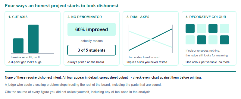
| Change over time | A single line with a zero-anchored or clearly marked axis | Two lines on two different axes | Dual axes can be scaled to imply a relationship that is not there |
| Spread or uncertainty | Dot plot showing individual values or a range | A bar showing only the mean | A mean from a small sample hides the variation a judge will ask about |
| Before and after in the same group | Slope chart connecting the two points | Two separate charts side by side | Separated charts force the judge to do the comparison in their head |
| Very small samples (under about 20) | The raw numbers, written out | Any percentage | "Sixty per cent" from three of five participants overstates the evidence |
Type, colour and density that survive both print and screen
Boards are usually judged in bright, crowded rooms, and increasingly the same artefact is also submitted as a file. A few rules hold in both settings.
- Two type sizes are not enough; five is too many. Title, section heading, body, caption. Four levels, and keep the ratio between them obvious — if a judge has to squint to tell a heading from body text, the hierarchy has failed.
- Body text in blocks of no more than about sixty words. Long paragraphs on a board are read by nobody. Convert anything longer into a list or a labelled diagram.
- Contrast beats colour. Dark text on a light background survives glare, bad printing and photocopying. Reserve saturated colour for data, not for backgrounds.
- Do not encode meaning in colour alone. Some judges will not distinguish your two greens. Add a label, a pattern of position, or direct annotation on the chart.
- Leave white space deliberately. A board that is 100 per cent covered reads as anxious. Empty margin is what makes the hero chart look like the hero.
- Print a test at final size before the real print run. Cheaply, on ordinary paper, taped together. Almost every font-size error is caught in the first ten seconds of doing this and in no other way.
From board to deck — and the production window
A slide deck is not a board cut into pieces. On a board the judge controls the order and can re-read; in a presentation you control the order and nothing can be re-read. Three differences follow. One idea per slide, because the audience cannot skip back. The finding goes early, not at the end, since questions often begin before you finish. And your slides should be readable without you talking, because in many formats the judges will be reading rather than listening for part of your time.
Two logistics points specific to China-based teams. First, the HOSA guidelines index carries an explicit note that the guidelines are written for the International Leadership Conference and that "States may have different event processes and deadlines, including upload deadlines!" Treat submission format and timing as something your own round defines, not something you can infer from the international document. Second, the guidelines page states that the 2026–2027 guidelines will be released on 1 September 2026 — so if you are designing in August, build the content and hold the final format decisions until the new guideline is published.
Plan the last week backwards: content locked at day seven, charts remade and checked against the four traps at day five, full-size test print at day three, final print or upload at day two, and the last day for rehearsal only. Teams that print on the final day are the ones who discover that a chart label is unreadable and have no time to fix it. For context on how the artefact fits the round it is judged in, see the ATC, CCE and BCE comparison, and the ILC guide for what the international conference environment involves.
Frequently asked questions
What size should my HOSA board be?
Board size and format are set per event and per season in the official guideline. Check the current guideline for your event on hosa.org before designing or printing.
How much text belongs on a competition board?
Less than most students expect. Keep body blocks to roughly sixty words, and move anything longer into a list, a labelled diagram or your spoken answer.
Should I show percentages from a small sample?
No. Under about twenty participants, print the raw counts. A percentage from a handful of people overstates the evidence and invites a difficult question.
When are the 2026-2027 guidelines published?
The guidelines page on hosa.org states the 2026–2027 guidelines will be released on 1 September 2026. Confirm format requirements there before finalising a design.
Published by the HOSA (SKT-iHOSA) editorial desk, operated by Hanlin Education for China-based international-school students. Official rules are set by the competition and change yearly — confirm current details on hosa.org. Errors are corrected within 7 working days.

Oct 20, 2026
iHOSA ATC Division I vs II: Allocating Study Time by Weighting Differences
Students in grades 9-10 and 11-12 face different topic weightings in the iHOSA ATC Biology and Chemistry exams. This guide breaks down…
Oct 17, 2026
iHOSA Biology Explanations: Connect a Feedback Loop to a Change in the Body
Mastering negative and positive feedback loops is essential for iHOSA Biology. Learn how to connect physiological mechanisms to observable changes with worked…
Oct 15, 2026
iHOSA Health Education: Test Whether an Audience Understood Your Message
In iHOSA Health Education, testing whether your audience understood your message is not an afterthought—it is the core deliverable. Learn how to…